


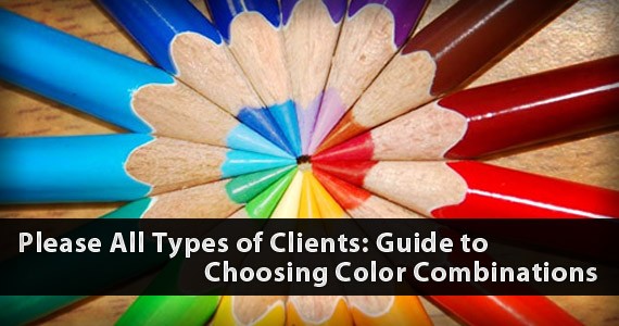
Every graphic designer knows that choosing the color combinations is among the most important parts of the design making process, on print or on the web. There is no universal color combination that will please all types of clients. For some designers, it is a matter of trial and error. But trial and error means you wasting plenty of precious time. Time is an important commodity in the graphic designer’s fast paced world. Through proper research, sense of style and good common sense, you can eliminate the long time of experimentation.
Understanding the Color Wheel
Before anything, it’s important to know the basics of the Color Wheel first. Every designer should by now have familiarized the color wheel by heart.
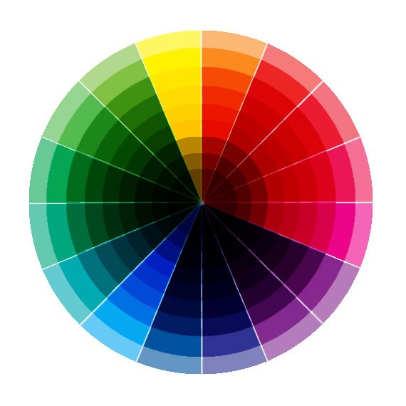
White light is a combination of all the colors of the spectrum, divided into three basic groups: red, blue and yellow. From these three colors, you can combine every color imaginable to the human eye. To be able to create aesthetically pleasing color combinations, you have to know how the color wheel first. I’ll try explaining it to you without being too technical.
For the monochromatic color scheme, it makes use of one color of different shades. For example, you use the following color combination for a web site:

The main color here is green, plus a lighter (50% white) green and a darker (50% black) green. Using monochromatic color combinations add a professional and sophisticated. It’s no fuss and straight to the point–thus it can get boring and monotonous (they have the same prefix, so…).
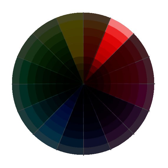
Complementary

The most interesting color combinations are those that show contrast and interest. This is by combining colors that are located opposite each other in the color wheel. They are bold, visually interesting and appealing. Just be sure to combine colors that look great together for your client’s company. Some combinations may look too gaudy–stay away from that.
Analogous
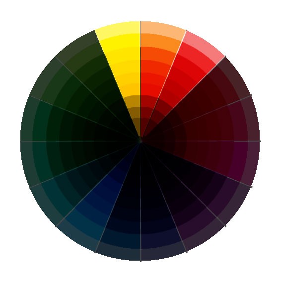
The analogous color scheme combines colors next to each other on the color wheel. They’re like the monochromatic scheme, great for professional and business uses. They are more interesting since they add contrast and interest into the canvas. Analogous color schemes are easy to work with and they always look great.
Here are some great examples of analogous color combinations:
Triadic
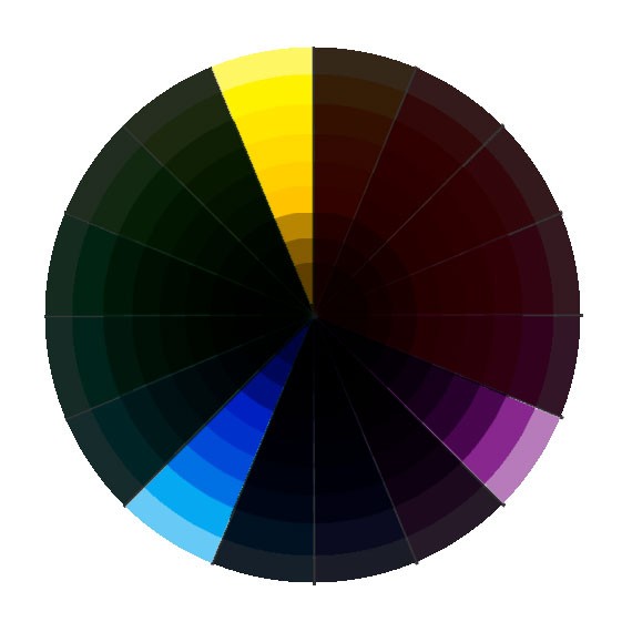
Triadic color schemes take three colors that are equally apart on the color wheel. They create a triangular shape when you connect the colors together. This type of color combination is aesthetically pleasing and well balanced.
Pleasing Clients with the Right Color Combinations
As mentioned earlier, you cannot please all clients with a universal color palette. You should know your client’s company first and foremost–what the company and their products are about, so that you can have a head start on picking the colors. Don’t forget to also check out successful logo redesigns.
Restaurants, Fast Food and Food Products
For companies that are centered on food and dining, use red and yellow a lot. These colors are attractive and easy to spot. Warm hues and solid colors are recommended. This is because the color red and yellow induces hunger by speeding up metabolism. This will increase the diner’s appetite, making them order more food than they should have. Avoid the blue and purple color for restaurants at all costs–these colors decreases one’s appetites. Subconsciously, our body reacts negatively to blue and purple toxins. Green and brown is a good color for relaxing and casual eating (think cafes and bistros). Try using colors in the triadic or complementary color scheme.
Here are some interesting color palettes for restaurants, fast food and food products:

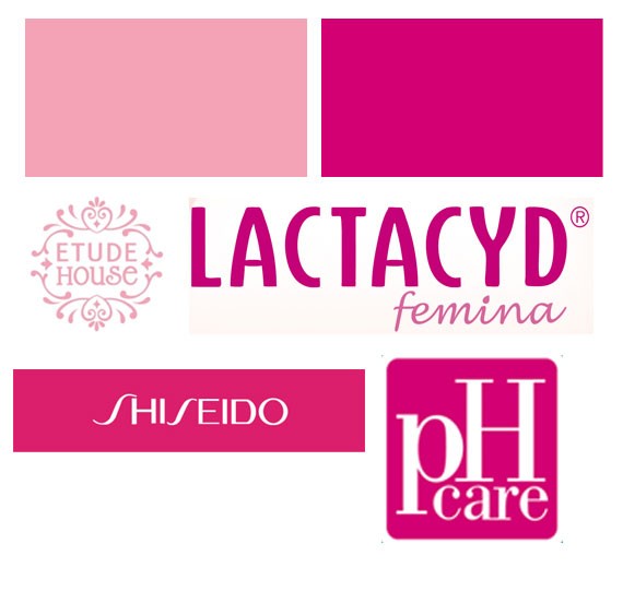
Makeup and Hygiene Products
Choose colors that convey femininity, grace and cleanliness. Light, pastel colors like white, lavenders, light blues and light pinks are a great choice. Avoid warm and harsh colors. You can also opt for monochromatic and neutral colors, for they signify cleanliness and simplicity. Here are some interesting color palettes for makeup and hygiene products:

Government Agencies, Public Offices, NGOs and Organizations
When creating something for government and public agencies or organizations, keep in mind that it should appear respectable, trustworthy and dignified. Choose colors that are positive and cool, such as greens and blues. These cool colors provide a positive, public image that’s solid and built on trust. Government and NGOs love using reds, whites and blues for their logos after the US American flag. These colors are also a sign of nationalism and integrity.Choose the monochromatic or analogous color scheme. Minimize on using contrasting colors.
Here are some interesting color palettes for public offices, government agencies and other organizations:


Logos or graphic design for educational establishments, insurance companies and hospitals also apply as well.
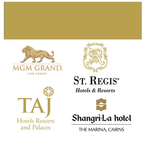
Hotels, Spas and other Hospitality Establishments
When designing for hotels, spas and resorts, capitalize on comfort, hospitality and relaxation. Choose ‘earthy’ and natural colors. Browns, blues and greens are the most relaxing and calming colors. Avoid bold colors. Make use of the monochromatic color scheme. Use colors only to a minimum, unless if it’s a Vegas establishment.
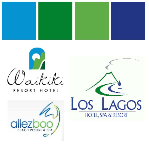
Blacks, whites, silver and gold are also a good choice of colors for hotels, spas and resorts, especially if it’s a five-star establishment and they wish to capitalize on luxury and class.
Conclusion
Color is a good way to catch the eye of viewers, but too much color will be distract your readers from looking closer and reading on. If you can, stick to 2 to 4 colors only.
Color combinations are not created on whim, but through careful research and study. By knowing the basics of the color wheel and combinations, you can create thousands of aesthetically pleasing color combinations.
Fuente: 1WD.CO


0 comentarios:
Publicar un comentario